Social Codes at Feral File
“Feral File” is a small and closely focussed NFT art market where the ten curated exhibits double as a gallery show.

Everything sold out. It sold so rapidly that the site crashed. These are good times for the non-fungible token. You can’t be the first to “own” these works — but you can view them.
https://feralfile.com/exhibitions
These ten artworks were originally priced at the modest sum of 75 dollars, in “editions” of seventy-five. They were swiftly grabbed by enthusiastic supporters of “Feral File,” who promptly repriced them at thousands of dollars.
Also, every participating artist was given one free copy of every other artist’s submission. Every blockchain project wants people to participate in a sticky user-base fashion.
The curator of Feral File is Professor Casey Reas, one of the founders of the visual arts programming language “Processing.” Open-source Processing ideology abounds behind the scenes at “Feral File.” Every artwork comes with a complete set of technical specs describing its creation.
“Feral File” does not use any blockchain currency; instead, the artworks are sold with credit cards. Feral File artworks are certified by the “Bitmark Rights System,” an open-source certification company that also hosts the “Feral File” website. Massive, energy-gobbling blockchains such as Bitcoin or Ethereum are absent.
If you buy an NFT artwork from the “Social Codes” show, what do you get? There’s an explanation of this on the Feral File website, detailing whose alleged rights belong to whom; blockchain people, open-source people, collectors and artists all love to debate these topics. If we entered that rabbit hole in this essay we would never emerge. So let’s focus on the artworks themselves.
It’s a given that digital art collectors are eager to buy these “Social Codes” artworks (because they all sold), but what are these artworks, exactly?
That’s hard to say. A critic might describe what the works do — they are artistic code that produces animated motion graphics, mostly abstract ones, on screens linked to the Internet. However, nobody seems to have settled on any clear, simple terms for art of this kind.
Instead, like the awkward term “NFT” — an acronym for the even worse term “Non-Fungible Token” — the creators and collectors have to use various long-winded work-arounds:
- Creative code
- NFTs
- Decentralized digital assets
- Limited-edition digital artworks
- Cryptoart
- Moments
- Loops
- Sketches
- Snippets
- VJ clips
- Collectibles
- Cards
- Loop cards
- Animations
- Nifties
- Gifs
- Mp4s
- Limited-edition art
- Browser based software
- Videos
- New media art
Obviously this is a crisis for art critics, because if you can’t state clearly what you are talking about, how can you set any standards for it?
As we’ll soon see, these ten artworks are not much alike. “Feral File” has managed to impose some commonality on these feral files, so as to make them “collectible.”
They’ve been assigned spots on the Feral File web page that are the same size. They’re described at similar word-length with the same font. Though they come from ten different artists, they all cost the same amount of money (or they did at first, anyway).
They’re all silent — they all lack soundtracks.
Technically, most use some Processing code, but not all of them.
There’s also a distinct element of professional polish here that was once rare in works like this. “Code art” composed with Processing was commonly called “sketches” or “snippets,” but these Social Code works are by no means sketchy or snippy. They’re lush, they’re heavy, they’re dressed up for public display — some are even ponderous.
So these are ten time-based, screen-based artworks in which artisanal code executes and some form is generated. We’re witnessing a hacker’s artform, very inchoate and slithery, taking on the non-fungible dignity of collectible videotapes or sixteen-millimeter film reels. Media theorists often say that a change in format changes everything.
Formats for digital art are messy, since no one has ever settled on a standard screen size. Mobiles are the dominant screens currently, a screen the size of your hand. So maybe these artworks are best understood as small visual contraptions held with bent elbows.
That doesn’t make much sense though, since they’re polished to such high fidelity. Maybe they’d make more sense on an iPad, that niche display device beloved by Apple users. However, since open-source figures so heavily in their presentation, maybe they belong on a big Linux desktop workstation with multiple screens.
Since they are commercially available artworks, I decided to max them out. One by one, I beamed them onto the largest bare wall in my house. I let them run on length as I went about my daily business.
Normally one confronts software art in much the way its artists do: by leaning tautly into a screen and pecking at it. Three of these works are interactive, so you have to lean in and tap some input to make them function.
However, projection frees them from these size constraints and brings out their genuinely alien qualities. Even in the jumbo size of sofa paintings, these artworks are not at all like paintings. They’re even radically different from other forms of “digital art,” such as 3d models or game-design props. Instead, they resemble kaleidoscopes and lava lamps. The aesthetic pleasure they offer is one of process.
Code executes: visual form moves around; often it loops and interpenetrates; it glides and shuffles through various subroutines; it mixes metronome rhythm with poetic recursion.
Let’s take the works in order, so as to get hands-on.
First, Dave Whyte, widely known by his code-art nom-de-plume of “Bees & Bombs.” He’s done many years of graphic work in the taut, compact, meme-friendly GIF format. He scatters these small-scale works hither and yon through social media, to the surprise and delight of many.
Bees & Bombs gifs are Internet eye-candy; they’re small, cute, clever and easy to pass on to friends. They’re composed of precise congelations of many small, regular graphic elements that pulsate or burst. These bees-and-bombs gifs resemble a honeycomb of bees bursting like a bomb. So they have an up-beat, animated, greeting-card quality.
His Feral File work “Shimmer” is a massive technicolor upgrade of this standard compositional style. All the work in “Shimmer” is performed by many small square elements in a rigid grid, something like overworked North Koreans holding up colored placards in their stadium bleachers. The gestalt is dazzling, with waves of diamond-shaped tints rhythmically sweeping all four sides of the screen. It’s the Cadillac version of a Bees & Bombs gif.
It’s a novelty, but novelty fades. “Shimmer” becomes peculiar when it’s huge and persistent. This grid-like composition clings to the wall as if born there. It becomes architectural. There’s something ageless and reptilian about it. It’s like the fevered breathing of a scaly Komodo dragon.
However, it’s too vivid to ever feel restful. “Shimmer” is too grand and glorious to succeed as a small, lightweight visual gimmick, but it still has the eyeball-grabbing hunger of a social-media GIF. It’s not entirely happy as glorious shimmering wallpaper: it wants to be clicked on, admired briefly, and promptly forwarded somewhere else.
Next, Saskia Freeke’s “Enchanting Luxuriance.” This is an interactive work, featuring many skeletal abstract lozenges with the look-and-feel of handheld mobiles. Hinting at the presence of buttons and screens, these minimal elements pulsate gently in pastel 1980s colors.
They can also be killed — clicked at by the viewer, and popped like soap-bubbles. But they don’t perish from the screen — because even more promptly form. They exist in luxurious profusion.
The gaming element makes this one fun, but it’s also tiring. The work’s title gives it an air of wry social commentary, too: maybe these devices are too enchanting in their luxuriance. In the long run, there are just too many of them. “Enchanting Luxuriance” resembles wallpaper more than most Feral File works, in that it has abstract repeating forms and features soothing interior-design colors. However, it’s not soothing; a hundred may feel luxurious, but ten thousand become a trial.
We now come to Frederik Vanhoutte’s “Lamia,” which is a typographic experiment deploying the text of “Lamia,” a verse-work by the Romantic poet John Keats.
This is the only Feral File work that is literary, and to see such bookishness popping up in software art feels odd.
Keat’s poem is scarcely legible. Vanhoutte’s 8-bit-looking cubic letterforms feel about as non-Romantic as text could get. However, the Keats poem “Lamia” is a good choice for a work of tech-art. This tragic poem is about a lonely girl-monster who longs to wed a human being but is defeated and vaporized by an unfriendly scientist. It’s a moral lesson for any technology that longs to become artistic.
I found that a long exposure to “Lamia,” seen at the large projector scale, is pleasant and inoffensive. “Lamia” is by no means obviously “poetic,” but it looks like it knows what it’s doing. The regular rhythm of the verses gives it the dignified feel of a grandfather clock.
The color palette is also well-chosen.
“She was a gordian shape of dazzling hue,
Vermilion-spotted, golden, green, and blue;
Striped like a zebra, freckled like a pard,
Eyed like a peacock, and all crimson barr’d,”
as the unlucky poet wrote as he advanced toward his tragic early death in Italy.
We now advance toward artwork number four, Maya Man’s “Can I Go Where You Go.” This unusual work features video clips of the artist dancing. It’s also interactive, because the viewer can use Maya Man’s cavorting body as an interactive cursor.
This work is likely better described as “new media art” than “code art,” because there is no sense of any software-structure being executed behind the scenes. It’s also by far the most humane work in the “Social Codes” show, because it features a human being — and a lithe and attractive female dancer, at that. The work is simple, and the conceit is very direct; I, the dancer, have a body, and you, the screen viewer, also have a body. So, “Can I go where you go,” can we use software art to admit that we both have bodies as well as screens, and that dance is an art-form?
At a large scale and long duration, this artwork is tedious; it’s just two little video loops spooling endlessly. However, it rather embarrasses the other artworks, because it has blood and breath in it; it really is “social” and sociable, and it makes the others feel desiccated by contrast.
We move on to describing artwork number five (while queuing up Mussorgsky’s “Pictures at an Exhibition” on YouTube). This work would be Manolo Gamboa Nuon’s well-titled “Uneasy Dream.”
On mature consideration, because I lived with “Uneasy Dream” at some length, I’d have to describe this one as the show’s avant-garde. Most code art is eager to show off its tech-chops, it likes to be hard-edged, precise and glittery, but “Uneasy Dream” is murky, creepy and melodramatic.
There’s a great deal of code “process” going on in “Uneasy Dream,” but it’s been artfully disguised; it turns in on itself and conceals its mechanics. In a striking palette of mineral blue and bloody haze, it mostly features long, thin arcs and rectilinear forms. These simple forms progress as if they have some clear intent, yet they never get anywhere; instead, they’re periodically obliterated by big, dreamy, flood-like color washes. On occasion the whole screen woozily ripples and distorts.
“Uneasy Dream” is not pretty, but there’s indeed something dreamlike about it; it has the eye-blurred feeling of failing to sleep in too-bright sunlight. Also, even with repeated viewings, it’s very hard to get accustomed to it. Its motifs seem simple, yet it never gets repetitious; its graphic elements embezzle qualities from one another, so that blobs become suddenly sharp-edged, while clear arcs become wormy or snakelike. This effect has to do with the sophisticated color-shading scheme, which seems to be detached from the graphic elements, so that form and color undermine each other, oozing and bleeding across the screen. It’s a messy work, even filthy, yet never chaotic, scratchy or glitchy; it has a Kandinsky-organic feeling, a breathing rhythm.
Like Impressionism or Divisionism, “Uneasy Dream” seems to be innovating with the viewer’s perception systems; instead of showing off code’s ability to impose visual forms on screens, it’s perversely using code as a new method to mess with the eye’s ability to visually comprehend.
I don’t like it much, but I admire it; I can see that it’s something special; it’s a different form of code art that somehow “paints from the shoulder.”
Work number six is “Arrels” by Anna Carreras. “Arrels” means “roots” in the Catalan language and this quite simple work is a series of growing, seething, root-like forms.
The code is very lucid in “Arrels.” It’s a series of disks that are gently propelled across the screen. As they move according to their code instructions, the disks overlap and shrink, leaving long, tapered, rootlike forms in their wake. Periodically the thick, twisted roots break up and reveal their fragile tips as little disks, which unmasks the process.
The muted color choices are nice, they have a folk-art feeling. The disks carry sketchy interior lines that give the roots a robust, hand-drawn, volumetric quality. The behavior of the roots varies; they emerge from different angles at different speeds and rhythms, and, rarely but pleasingly, one of them manages to root its way across the entire screen.
There’s nothing earth-shaking about “Arrels,” but if I had to live with one of these artworks for the rest of my life, it would likely be this one. It lacks high-tech gosh-wow, but it has the pleasingly gnarly feeling of the roots of an olive tree.
Artwork seven of ten is Raven Kwok’s “1DE94,” which is just as technical as its title. This interactive piece consists of branching black and white grids. The spidery grids will spontaneously mutate if left alone, but if clicked-and-pulled by the viewer, they perform quick little fractal prodigies of re-organization and re-stabilization.
“1DE94” is fun to mess with and has plenty of tech bravura, but its most interesting aspect, to my eye, is that it is also cartoon-animated. Somehow Raven Kwok has given the work the reactive “bounce” beloved of Walt Disney studios in the 1920s and 30s, which gives the code a surprising, perky quality.
Seen at large scale “1DE94” is quite grand and spooky, with a portal-to-cyberspace feeling. But, like a lot of one-shot interactive work, it’s also toylike, and one wouldn’t want to play with it for hours on end. One can imagine automating it as a public art-work, though — for instance, having passing guests disturb it as they walk through a hotel lobby. It’s hard to beat for a hardcore computational-aesthetic, and it almost shouts “digital art.”
Artwork eight is Dmitri Cherniak’s “Transparent Grit.” This work consists of gently-colored, rotating lens-flare elements that disintegrate into fine colored particles. These elements also occlude one another, because they’re mapped onto rotating, globe-shaped surfaces that appear to be spheres but aren’t.
“Transparent Grit” is easily as entertaining as most desk-toy snow-globes, and if you’re interested in visual-FX issues such as ray-tracing and lens flares, it’s admirable. But it’s mostly colored mist and empty space, so even at large scale for a solid hour it’s hard to become involved with it. “Transparent Grit” has the feel of a sketch or demo; it’s so wispy and insubstantial that there’s not much at stake.
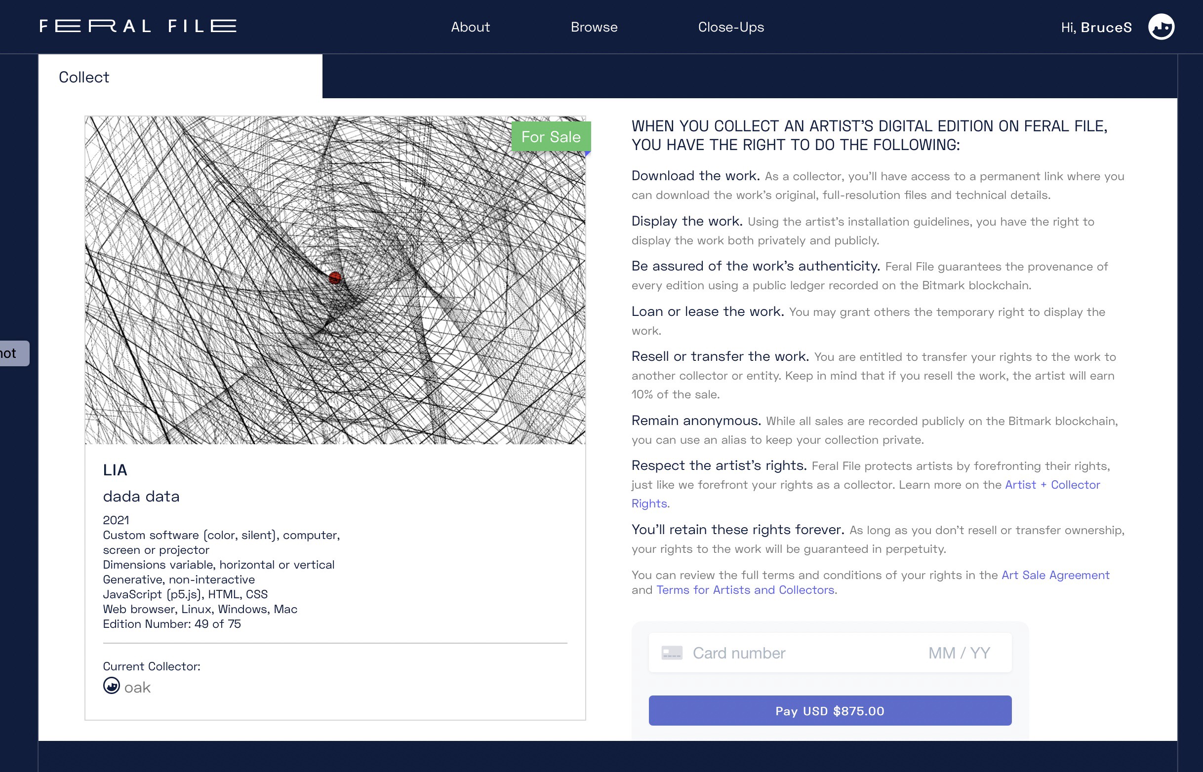
The ninth and next-to-last artwork is “Dada Data,” where Processing veteran “Lia” proceeds to roll out her heavy artillery. Most Lia sketches are two-dimensional, brightly colored, swirling and lyrical, but this one is a stark, monumental, rotating skeleton of grid-lines.
A single, central red dot is helpfully included to point out that the conventions of geometry and perspective are being warped, and indeed they are; this busy, splintery construction spins, rotates, wheels and counterwheels, fans out, manifests vertices, interlocks and breaks… It mocks “3D” simulations by playing perspectival eye-tricks with the thickness of the lines, and the speed at which they move and group together.
At a large size, this grandiose work quickly moves from merely spidery to outright-spectral. There’s even the occasional Op Art seasick lurch. As a code artist, Lia seems one of the practitioners most in touch with the 20th-century heritage of the craft: clean and lucid, seeking maximal effects with minimal means.
This is the work in the show most likely to be appreciated in thirty years. I wouldn’t call it charming or pretty, it’s quite stark and bleak and it sometimes verges on a swoony 4-D Non-Euclidean, but it’s hard to like code art and not like “Dada Data.”
Last comes Andrew Benson’s “Scrampled,” which likely should have been the first work reviewed. “Scrampled” is about the technician’s pleasure in deploying new tools; the artist has invented a software tool all his own, something like a giant glitch-like cursor, and the thing proceeds to bulldoze around the screen, wreaking some brightly-colored, technically-interesting havoc.
If you’re into innovative scrapping and crumpling, then “Scrampled” really shoves pixels. Periodically a candy-colored mist arises to erase the trail of devastation and give the thing free rein again.
At wall-size, “Scrampled” basically resembles rapid corrosion. It suggests high-speed plaster-decay, a rotting process of popping, decaying and colorful delaminating. So I wouldn’t call it “unnerving” exactly, but this work doesn’t do well outside its tight context of bravura technical pixel-crunching.
So that was the “Social Codes” show. I enjoyed it about as much as Mussorgsky liked that gallery show he wrote that music about, and I’m looking forward to seeing more. Hopefully “Feral File” will curate other code artists soon, because they abound nowadays. Maybe “Feral File” will become a worthy and dignified professional showplace for software art that respects the craft aspects of code. As opposed to most other NFT art to date, which is frantically cluttered with commercial “blockchain art” that’s intended to flatter the wealthy owners of blockchains.
Money changes everything; the line between fungible and non-fungible may sound abstract or even silly, but it’s heavy, it’s dreadful, and it clearly signals a change of eras.